But every time Apple does this song and dance, we seem to sit throughout the keynote going, “Whoa, that’s been on Android forever.” Or even, “Umm, that looks just like how Android works.” Today was no different. While iOS 7 looks nice from the outside, many of the new goodies remind us a lot of our favorite mobile OS.
And not that we should need to remind you, but don’t take this too seriously. We’re just having some fun and pointing out things that gave us a chuckle. We are happy to see iOS evolve, just like we will be happy to see every other mobile OS evolve. Companies pushing boundaries and taking features to new levels is what we love about this industry.
Quick Toggles (Command Center)
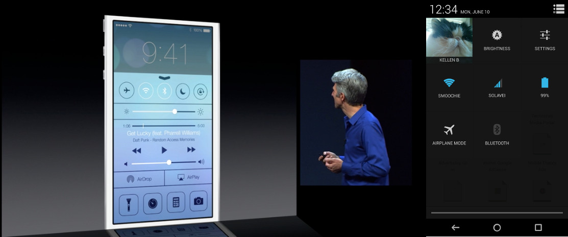
Apple is adding in a gesture for accessing Command Center from anywhere on an iOS device. A quick swipe up from the bottom of the screen and you are graced with a panel filled with toggles for Airplane mode, WiFi, Bluetooth, brightness settings, music controls, camera shortcut, and even a flashlight. As you all know, Android devices have had access to similar information for a while thanks to 3rd party skins from manufacturers. But in Android 4.2, Google introduced a panel as well that can be accessed with a two-finger swipe down from the notification bar. Music controls have been in the notification bar for some time, so that’s not necessarily new.
Lock Screen Notifications
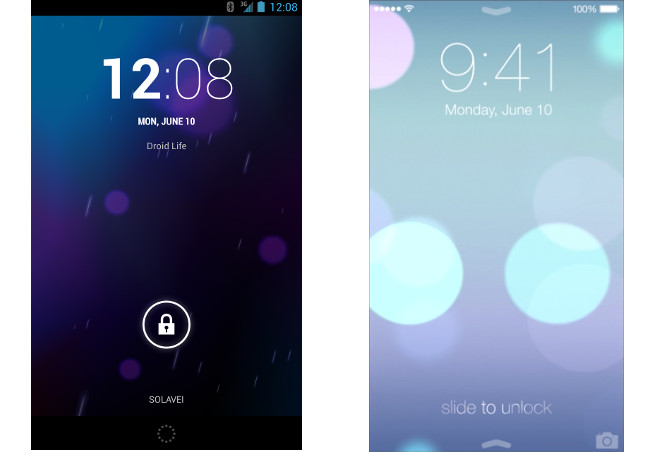
I found this out today, but apparently iOS did not let you access their notification center from the lock screen. Android has been on this trend for at least two versions, but Apple is just now introducing it with iOS 7. Once released, iOS users will be able to swipe down their notification bar without unlocking their device.
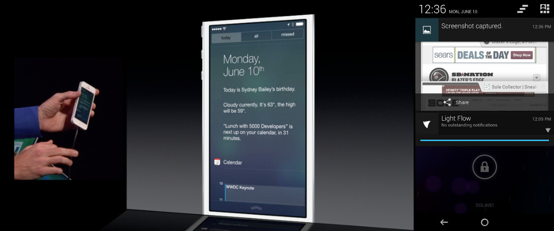
The new notification center has done away with that terrible looking felt background and is more transparent. There are tabs for “Today,” “All,” and “Missed.” I like the idea of panels, though Android seems to have been able to handle all of this information without needing extra panels. Thanks to actionable and collapsable notifications on Android, you only need one area for all of this.
Safari vs. Chrome
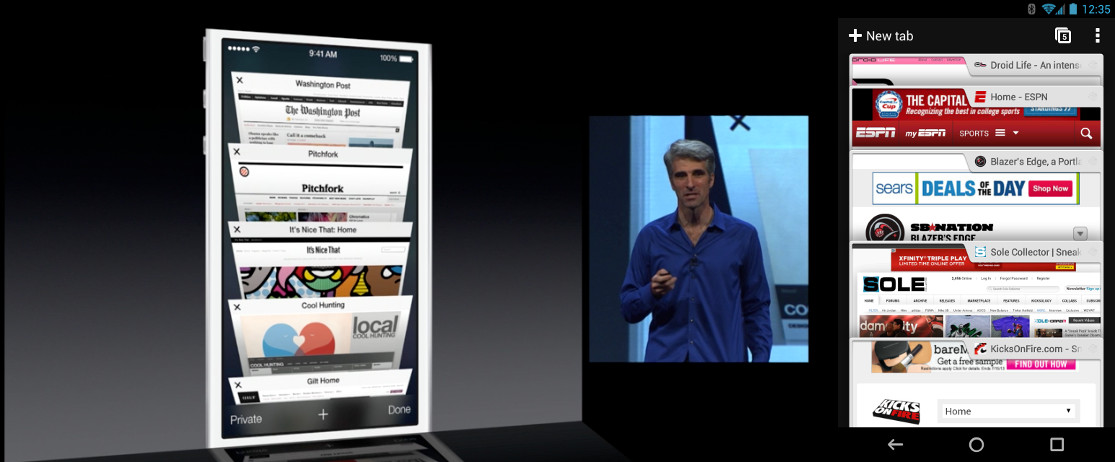
Safari is Safari – most people can’t stand it and prefer browsers like Chrome for their browsing needs. But one thing we thought was interesting in the new UI of Safari, was the tab view that shows all open tabs. They bragged about the 3D appearance, scrolling, and quick access to other tabs yet we have had this in Chrome for Android since it was first released over a year ago.
Multi-tasking
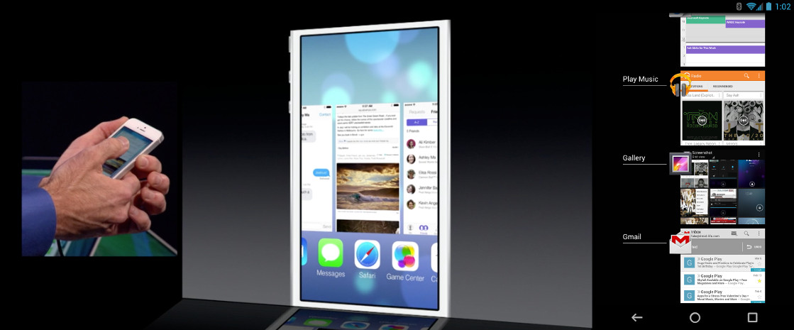
Multi-tasking! iOS 7 has a new style of multi-tasking that only runs in the background when it thinks you want access to frequently used apps. It essentially learns from your patterns to help extend your battery life. That’s kind of cool, assuming it can learn properly, which we won’t know anything about until people can spend some time with it. But in general, we like the idea of phones learning our patterns to better optimize our lives with them.
But in terms of a UI, Apple created something semi-unique. It’s not an exact copy of Android, since it scrolls horizontally and features full-screen previews of currently running apps. It does look a lot like what HTC did back with Sense 4, though HTC abandoned the look after hearing pretty terrible reviews of the change.
iTunes Radio vs. Google Music
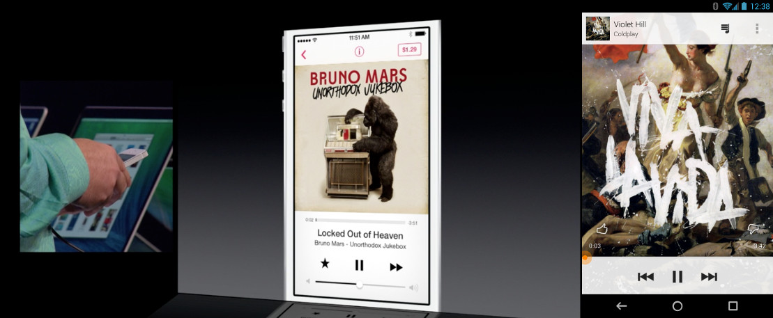
Apple did in fact announce a Pandora competitor this morning called iTunes Radio. It’s really not all that game-changing or innovative. You can create your own radio playlists based off of songs, or you can use recommended stations that Apple has ready to go. There are massive “BUY” buttons all over the place, along with ads, unless you are an iTunes Match customer. But you can’t save full albums or tracks to your library like you can with Google’s new All Access service, nor can you pick and choose specific songs to create playlists. It’s just like Pandora in that it brings up songs that it thinks match what you are looking for and then allows you to downvote them or favorite them, so that they’ll play more often. It’s a nice add-on to iTunes, but nothing new.
In terms of looks, the new Google Music and new Music apps look a lot a like. We’re seeing white menus and similar UI with big, bold album art.
Also, we should point out that Google Music All Access gives you unlimited access to albums and songs because it comes with a monthly fee.

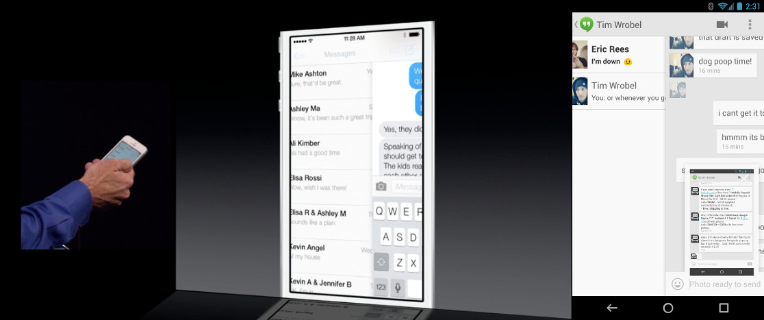
While I don’t know how many people actually use the stock Mail app in iOS, it’s easy to see that they have stolen features from the popular iOS app called Mailbox. Apple added in swiping gestures, for deleting, archiving, and “More” options. It’s a complete copy of what Mailbox already made popular, and I can’t believe people aren’t throwing massive fits over this. But then again, this is what Apple does time and time again to its developer community.
Oh, and Gmail has had swipe-to-delete/archive for longer than I can recall.
Calendars
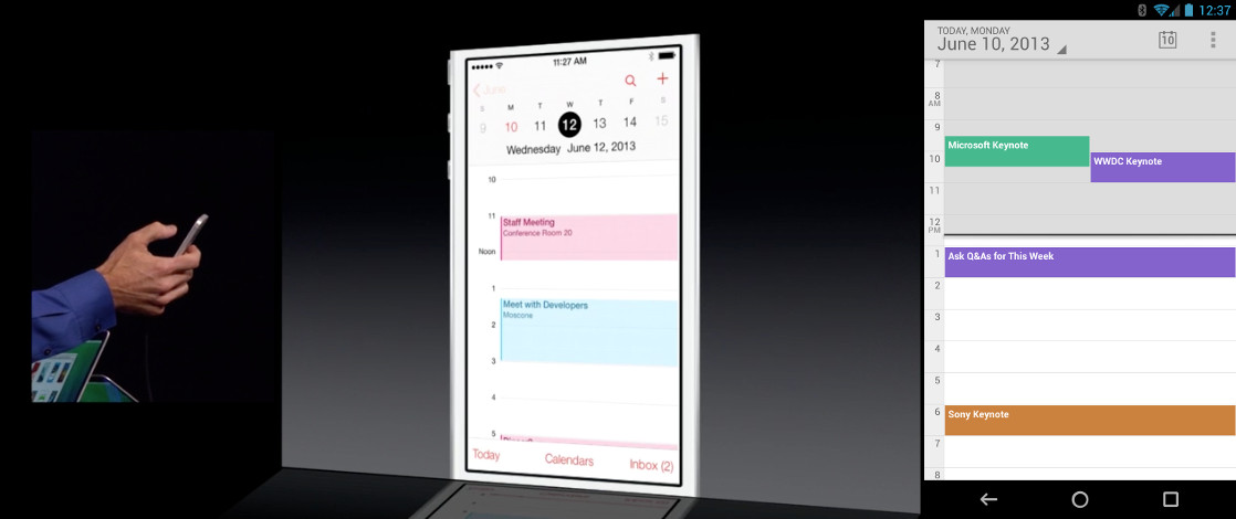
The new iOS Calendar app doesn’t look all that much like that of Android, but the similarities are still there. We’re looking at an ultra-minimal design, with flat rectangles, pastel-ish colors, and a white background rather than the round appearance of the current iOS Calendar app. And in fact, the newest Calendar app from Google has similar design in the circular color picker and date chooser to what we are seeing in iOS, only it came out a couple of weeks ago.
Navigation Drawers
Apple added a bunch of slideout navigation drawers to apps like Mail and iMessage. We have seen these in Google apps for over a year now (even the ones on iOS), but they made a point of the addition today as if it were something “new” to app development. No, Apple, it’s not new.
Lock Screens
TAGS :


COMMENTS